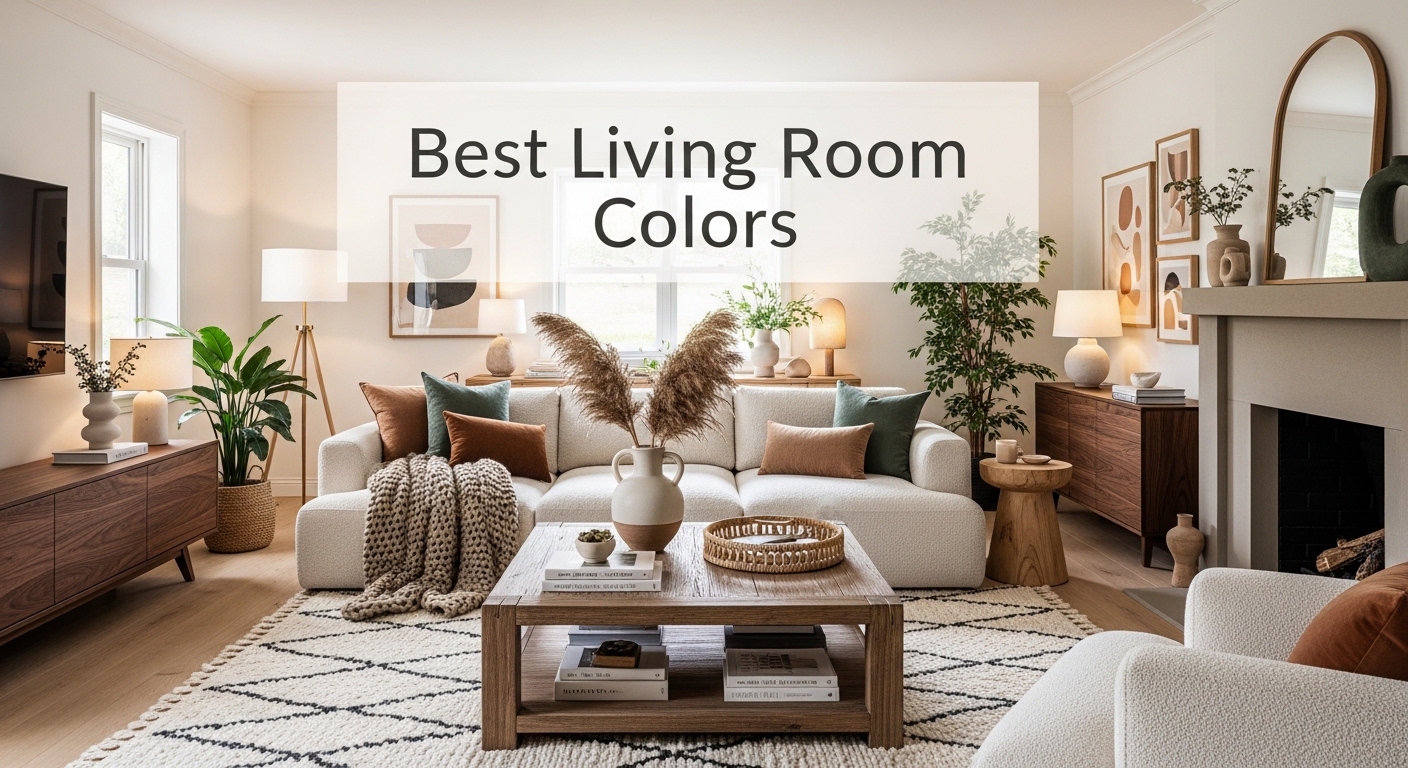
Best Living Room Colors for American Homes in 2026
You’ve rearranged the furniture three times. You bought a new rug. You added throw pillows in every texture imaginable. But something still feels off and deep down, you already know what it is. The color on your walls is doing your living room absolutely no favors. Choosing the best living room colors is one of the most powerful and most agonized-over decisions American homeowners face, and it’s completely understandable why.
The right wall color doesn’t just change how a room looks it changes how a room feels. It affects your mood every single morning, influences how spacious your space feels, and sets the entire tone for your home’s personality.
In this article, you’re going to discover the best living room colors for American homes in 2026 from timeless neutrals and bold statement shades to soft pastels and earthy tones that designers are obsessing over right now. We’ll cover specific paint brands, finish types, styling tips, and budget-friendly ways to pull each color off beautifully.
Get ready to finally fall in love with your living room walls.
Why Living Room Color Choice Matters More Than Ever in 2026
Color is the single most affordable way to completely transform a living space and yet most Americans play it so safe they end up with walls that blend into the background rather than elevate the entire room.
Here’s a surprising fact: according to a Sherwin-Williams consumer survey, over 70% of American homeowners say they regret their paint color choice within the first year. That’s not because they chose boldly it’s usually because they didn’t choose intentionally.
In 2026, American homes are shifting away from the cold gray and stark white era that dominated the 2010s. Homeowners are embracing warmer, more personal, and more expressive color palettes. Open floor plans in suburban homes and compact apartment living spaces both demand colors that are versatile, mood-boosting, and stylistically cohesive.
Interior design in America is getting personal again and color is leading the charge.
Best Living Room Colors for American Homes in 2026
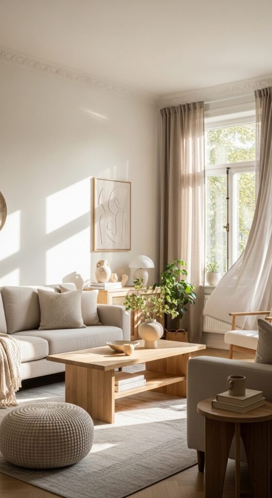
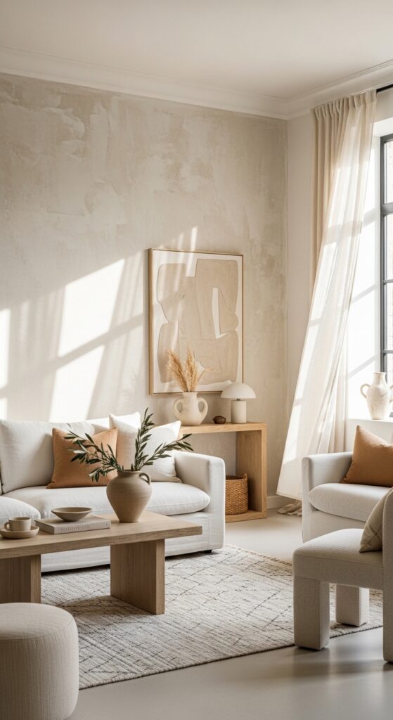
1. Warm White — The Best Living Room Color for a Timeless, Airy Look
Warm white is not the same as bright white and that distinction is everything. Bright white can feel cold, clinical, and harsh, especially in rooms with limited natural light. Warm white, on the other hand, wraps a room in softness and makes every material inside it look better.
Think shades like Sherwin-Williams Alabaster (SW 7008), Benjamin Moore White Dove (OC-17), or Behr Cameo White. These are the most recommended warm whites by interior designers for American living rooms in 2026. They read as clean and bright but carry a subtle undertone of cream or ivory that adds instant coziness.
Also Read: Accent Wall Ideas for Living Room
Warm white works beautifully with:
- Natural oak wood furniture and floors
- Linen and boucle fabric sofas in cream or beige
- Brass and gold metal accents
- Soft rattan and jute textures
How to try it today: Pick up a peel-and-stick paint sample from Home Depot or Lowe’s for about $4–$6. Apply it directly to your wall in a 12×12 inch square and observe it at different times of day morning light, afternoon sun, and evening lamp light all change how a color reads.
Budget paint option: Behr Premium Plus in Cameo White at Walmart or Home Depot around $30 per gallon. Premium option: Farrow & Ball’s All White or Strong White at $115 per gallon for an ultra-luxurious, light-diffusing finish.
Pro Tip: Always test warm white paint next to your largest furniture piece. If your sofa is a cool gray or bright white, certain warm whites can clash. Look for whites with yellow or pink undertones rather than blue undertones for the coziest result.
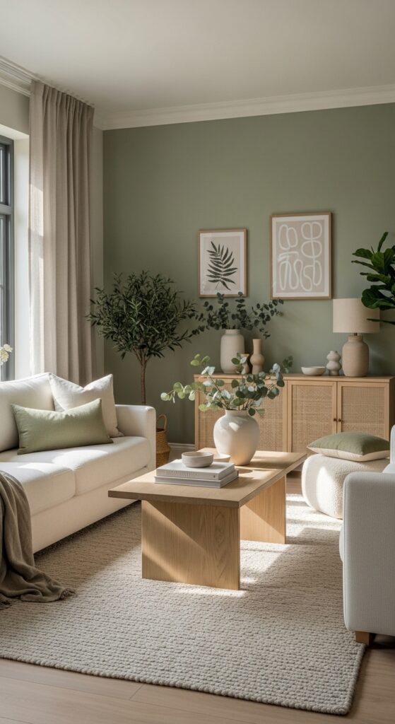
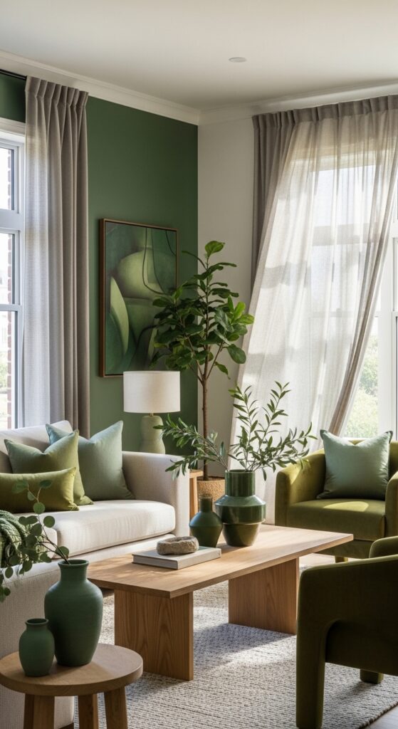
2. Sage Green — The Color Every American Living Room Wants Right Now
If there is one color that defines the living room aesthetic of 2025 and carries straight into 2026, it is sage green. This muted, dusty, earthy green sits right at the intersection of nature-inspired and sophisticated and it works in virtually every American home style.
Sage green pairs flawlessly with:
- Warm wood tones (oak, walnut, pine)
- Cream and warm white soft furnishings
- Terracotta and burnt orange accents
- Brass and aged bronze hardware and fixtures
- Natural linen and cotton textiles
Top paint picks:
- Sherwin-Williams Evergreen Fog (SW 9130) — the most-pinned sage green on Pinterest
- Benjamin Moore Saybrook Sage (HC-114) — deeper, richer sage with gray undertones
- Behr Dusty Miller — a budget-friendly option that reads beautifully in natural light
Sage green suits Modern Farmhouse, Japandi, Boho, and even Mid-Century Modern aesthetics. It’s one of the most versatile living room colors available, which is exactly why it’s dominating American home design in 2026.
How to start today: Order two or three peel-and-stick paint swatches in different sage green shades from Samplize.com (around $7 each) no mess, no brushes, just stick them up and compare.
Pro Tip: Paint your living room in sage green and leave your trim and ceiling in warm white. This contrast grounds the walls beautifully and makes the ceiling feel higher — a trick that works especially well in suburban homes with standard 8 or 9-foot ceilings.
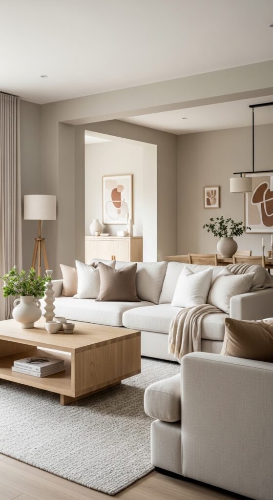
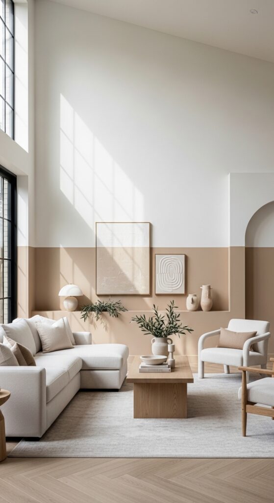
3. Warm Greige — The Most Versatile Living Room Color for Open Floor Plans
Greige the perfect blend of gray and beige is the ultimate chameleon of living room colors. It works with virtually everything, photographs beautifully, and creates a backdrop that feels both modern and warm. In 2026, warm greige is having its biggest moment yet as Americans move away from cool grays toward earthier, more inviting tones.
The key is choosing a greige with warm undertones (beige-leaning) rather than cool undertones (gray-leaning). Cool greiges can look dingy and flat in rooms without a lot of natural light.
Best greige paint colors for American living rooms:
| Paint Color | Brand | Undertone | Best For |
|---|---|---|---|
| Accessible Beige SW 7036 | Sherwin-Williams | Warm beige | Any style |
| Agreeable Gray SW 7029 | Sherwin-Williams | Warm gray | Modern, Farmhouse |
| Revere Pewter HC-172 | Benjamin Moore | Green-gray | Traditional, Classic |
| Pale Oak OC-20 | Benjamin Moore | Warm pink-beige | Coastal, Minimalist |
| Wheat Bread | Behr | Golden beige | Boho, Rustic |
How to start today: Sherwin-Williams Agreeable Gray is America’s best-selling paint color for a reason. Get a sample quart ($5–$8) at your nearest Sherwin-Williams store and test it on your largest wall. You’ll likely wonder why you haven’t painted your whole house in it.
Pro Tip: In open floor plan homes, use greige throughout the living room, dining area, and hallway to create a seamless, pulled-together flow. It’s the most cohesive choice for homes where multiple rooms are visible from one vantage point.
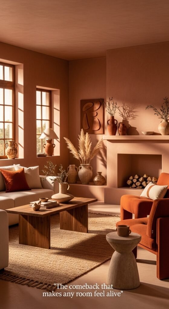
4. Terracotta and Clay — The Earthy Living Room Color Making a Major Comeback
Terracotta is warm, grounding, confident, and deeply connected to natural materials — which is exactly why it’s one of the most exciting living room color trends for 2026. This isn’t the burnt orange of the 1970s. Today’s terracotta is more refined, dusty, and sophisticated.
Think warm clay tones, adobe-inspired shades, and sun-baked earth tones that create a living space that feels both cozy and artistically intentional.
Top terracotta paint picks:
- Sherwin-Williams Cavern Clay (SW 7701) — the most popular terracotta shade in America right now
- Benjamin Moore Earthen Jug (2164-30) — deeper, richer clay tone
- Behr Adobe Dust — an affordable option with beautiful matte finish results
Terracotta pairs beautifully with:
- Cream and warm white linen sofas
- Dark walnut wood furniture
- Woven rattan and jute textures
- Deep green plants (fiddle leaf fig, monstera, olive tree)
- Brass and hammered copper accents
How to style it: Don’t paint all four walls terracotta in a small room it can feel overwhelming. Instead, use it as an accent wall color behind the sofa or TV wall. Pair the remaining walls in warm white or pale greige for balance.
Pro Tip: Terracotta walls look even more stunning in a matte or flat finish. The lack of sheen gives the color depth and a plaster-like, Mediterranean quality that eggshell or satin finishes can’t replicate.
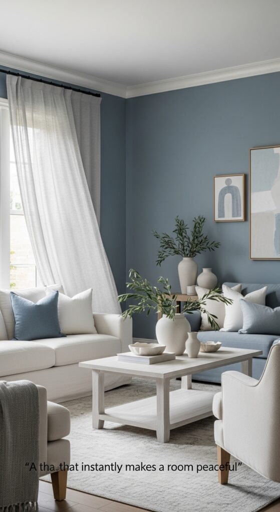
5. Dusty Blue — A Serene Living Room Color That Never Goes Out of Style
Dusty blue is the color equivalent of a deep breath. It’s calm, collected, sophisticated, and surprisingly versatile. Unlike bright or navy blue, dusty blue has a softened, muted quality almost as if the color has been lightly washed that makes it feel timeless rather than trendy.
In 2026, dusty blue is particularly popular in Coastal, Scandinavian, and Romantic interior styles all of which are thriving in American homes right now.
Best dusty blue paint picks:
- Sherwin-Williams Rain (SW 6219) — a perfectly muted, cloudy blue
- Benjamin Moore Buxton Blue (HC-149) — classic and sophisticated
- Behr Dusty Miller Blue — affordable and widely available at Home Depot
What to pair with dusty blue:
- Natural linen and cotton textiles in cream and warm white
- Light oak and bleached wood furniture
- Soft brass and matte black hardware
- White ceramic and marble accents
- Greenery eucalyptus, ferns, and trailing ivy
How to start today: Paint just the fireplace wall or the TV accent wall in dusty blue. Leave the other walls in warm white. This instantly creates a designer-level layered look with minimal paint and maximum impact.
Pro Tip: Dusty blue walls with warm brass light fixtures create an absolutely stunning combination. The warm metal against the cool-ish wall creates the kind of contrast that looks intentional and elevated like something from an Anthropologie lookbook.
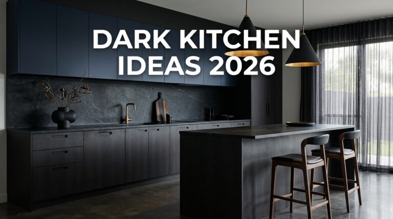
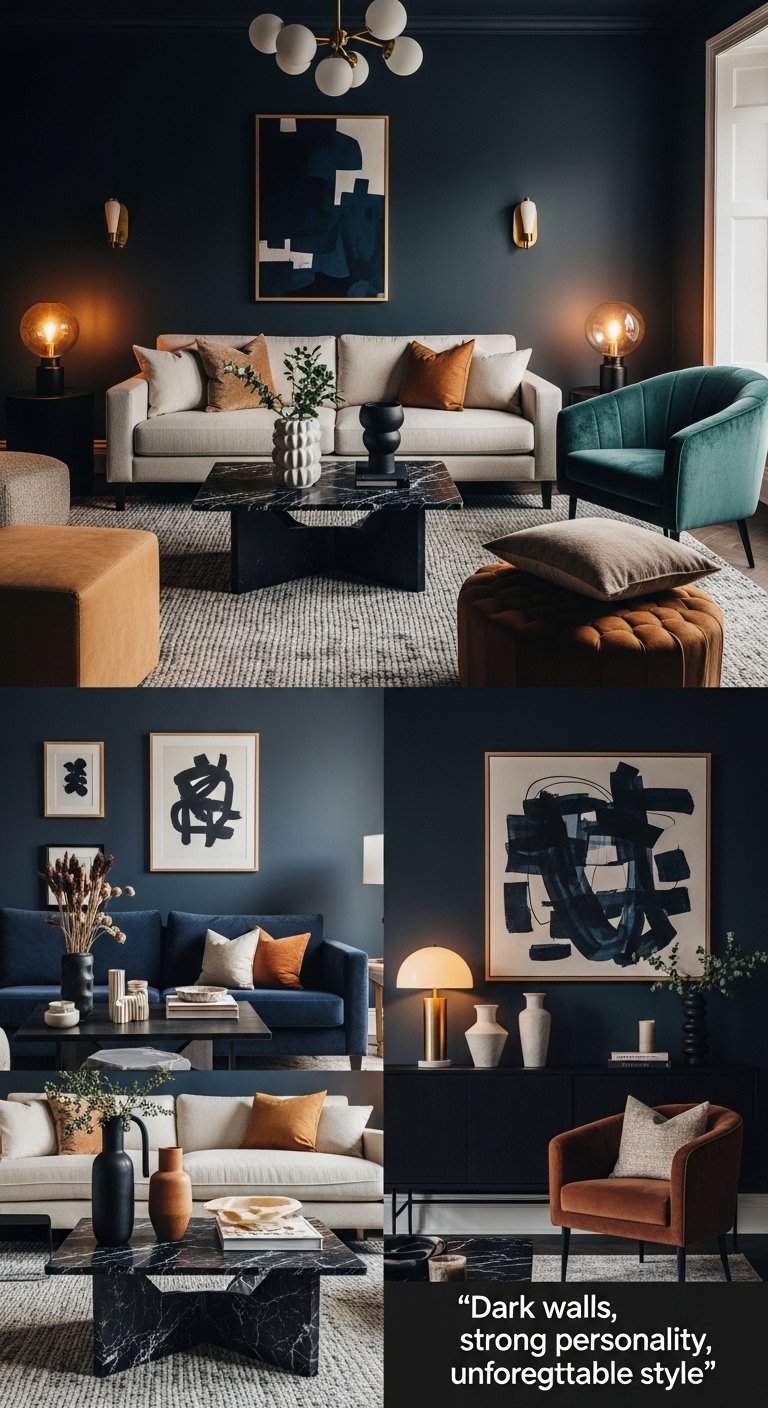
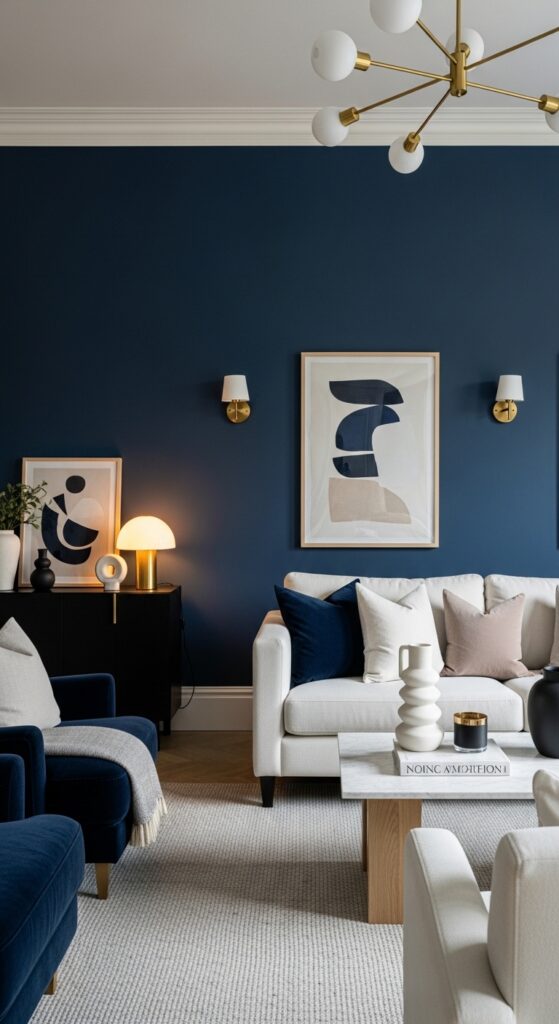
6. Deep Moody Colors — Bold Living Room Colors for the Confident Decorator
Dark, moody colors are no longer just for formal dining rooms or masculine studies. In 2026, deep, saturated wall colors are showing up in living rooms across America and they look absolutely spectacular when done right.
Think deep forest green, charcoal, navy blue, plum, and inky black. These colors create a cocooning effect making a large, airy room feel intimate and dramatic, like a luxurious boutique hotel lobby.
Top moody paint colors for living rooms:
- Sherwin-Williams Tricorn Black (SW 6258) — the most popular dark paint in America
- Benjamin Moore Newburyport Blue (HC-155) — deep coastal navy
- Sherwin-Williams Rookwood Dark Green (SW 2809) — rich, moody forest green
- Farrow & Ball Hague Blue (No.30) — a legendary deep teal-blue used in high-end homes worldwide
How to pull off dark walls successfully:
- Use them on one accent wall only if your room is small
- Add plenty of warm lighting — floor lamps, table lamps, wall sconces
- Keep furniture in lighter tones (cream, warm white, light oak) to balance
- Layer textures — velvet, linen, wool — to add richness
Pro Tip: Paint your ceiling the same dark color as your walls for a truly dramatic, enveloping effect. This “paint the box” technique is one of the most talked-about design trends in American homes heading into 2026. It feels bold but looks absolutely incredible.
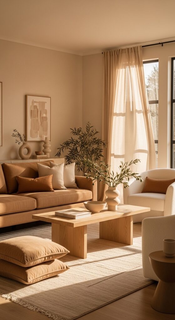
7. Warm Beige and Camel Tones — The Comeback Color of 2026
Beige is back — and it’s better than ever. After years of being dismissed as boring, warm beige and camel tones are experiencing a full-scale renaissance in American interior design. The key difference between the flat beige of the 1990s and today’s warm beige? Depth, warmth, and intentional styling.
Today’s warm beiges have golden, honey, or amber undertones that glow beautifully in natural light and create an instantly inviting atmosphere in any living space.
Top warm beige and camel paint picks:
- Benjamin Moore Hasbrouck Brown (HC-69) — a warm, honey-inflected beige
- Sherwin-Williams Antique White (SW 6119) — creamy, warm, and incredibly versatile
- Behr Toasted Coconut — a deeper camel tone with gorgeous golden warmth
Style this look with:
- Cream and ivory boucle or teddy fabric sofas
- Dark walnut or espresso wood side tables and bookshelves
- Caramel leather accent chairs
- Brass and antique gold light fixtures
- Woven jute rugs in natural or honey tones
Pro Tip: Pair warm beige walls with a statement ceiling in a slightly deeper shade of the same color family — like a soft caramel or warm honey. This tonal ceiling technique makes a room feel custom-designed and architecturally interesting without any actual construction.
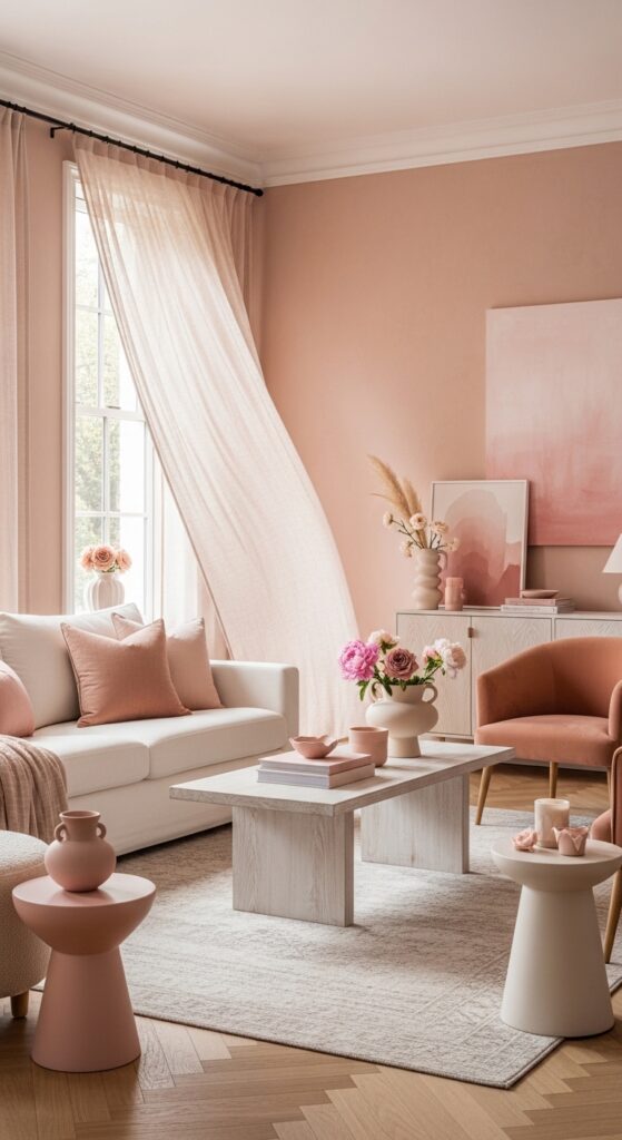
8. Soft Blush and Warm Pink — The Unexpected Living Room Color That Actually Works
Before you scroll past this section — hear us out. Soft blush and warm pink are some of the most sophisticated and livable colors you can put in a living room, especially when they lean toward the dusty, terracotta-pink side of the spectrum rather than bright candy pink.
Think: dusty rose, muted blush, adobe pink, antique pink. These shades create a living space that feels warm, feminine without being precious, and genuinely unique in a sea of gray and greige American living rooms.
Best blush and pink paint picks:
- Sherwin-Williams Mellow Coral (SW 6343) — warm, dusty, absolutely beautiful
- Benjamin Moore Pale Blush (2173-70) — soft and subtle, almost neutral
- Farrow & Ball Setting Plaster (No.231) — a legendary dusty pink used in design-forward homes worldwide
How to start today: If you’re nervous about pink walls, start with a blush-pink throw blanket ($25–$40 at Target), a blush ceramic vase from HomeGoods ($15–$30), and a pink-toned art print. Live with the color in small doses before committing to the walls.
Pro Tip: Blush pink walls look most sophisticated in a matte or flat finish. Combine them with deep green plants, warm brass accents, and natural linen textures for a result that feels earthy and grounded rather than overly sweet.
9. Limewash and Textured Paint Finishes — The Most Stunning Living Room Color Trend of 2026
This is the biggest paint trend of 2026 — and it’s not really about a specific color. Limewash paint creates a layered, ancient, plaster-like finish that adds incredible depth and texture to any wall. The result looks like something you’d find in a Tuscan villa or a Parisian apartment, but you can achieve it in an American suburban home for under $200.
Limewash is available in virtually any color — warm white, sage green, terracotta, dusty blue — but the most popular choices for American living rooms are:
- Warm white limewash (creates a bright, airy, organic feel)
- Terracotta limewash (warm, Mediterranean, deeply textured)
- Sage green limewash (earthy, sophisticated, nature-inspired)
Best limewash paint brands:
- Portola Paints Roman Clay — $85–$95 per gallon, available online and at select paint stores
- Limelight by Sherwin-Williams — widely available, $45–$65 per gallon
- ROMA Marmorino — premium Italian-style limewash, $90–$120 per gallon
How to start today: Watch one YouTube tutorial on limewash application — it’s genuinely easier than it looks. You apply it with a wide brush in overlapping X-pattern strokes, and the imperfect, varied result is literally the point.
Pro Tip: Limewash is naturally breathable and antimicrobial — a genuine functional benefit in addition to its stunning appearance. It also gets better looking over time as it ages and develops even more character.
10. Two-Tone Color Combinations — The Advanced Living Room Color Strategy
One of the most underutilized color strategies in American homes is the two-tone wall treatment — using two different colors on the same wall or splitting the upper and lower halves of a room in complementary shades. When done well, this technique adds architectural interest, depth, and a custom-built feeling to any living space.
Popular two-tone combinations for 2026:
| Bottom Color | Top Color | Style Match |
|---|---|---|
| Sage Green | Warm White | Farmhouse, Japandi |
| Terracotta | Cream | Boho, Mediterranean |
| Navy Blue | Soft Gray | Modern, Coastal |
| Deep Green | Warm White | Mid-Century, Traditional |
| Warm Beige | Soft White | Minimalist, Classic |
The split typically happens at chair rail height (32–36 inches from the floor) or at one-third of the wall height for a more dramatic, contemporary effect.
How to start today: Tape off a horizontal line at chair rail height on one wall. Paint the bottom section in your chosen accent color and leave the top in your existing wall color. Step back and see how dramatically it changes the room — before committing to the entire space.
Pro Tip: Add a thin strip of decorative molding (available at Home Depot for $1–$3 per linear foot) right at the color divide line. This elevates the entire treatment from “painted wall” to “architectural feature” — instantly.
11. Greens Beyond Sage — Exploring the Full Green Spectrum for Living Rooms
Sage green gets all the attention, but the broader green color family offers some of the most beautiful and underused living room colors available. In 2026, we’re seeing a surge in interest across the entire green spectrum — from pale mint to deep forest to rich olive.
The green spectrum for living rooms:
- Pale Mint / Soft Celadon — light, fresh, great for small apartments (Benjamin Moore Palladian Blue HC-144 or Sherwin-Williams Celandine SW 0017)
- Olive Green — warm, earthy, works beautifully with wood and leather (Sherwin-Williams Oakmoss SW 6180)
- Forest / Deep Green — dramatic, sophisticated, stunning as an accent wall (Benjamin Moore Hunter Green 2041-10)
- Moss Green — organic, textured feeling, pairs well with limewash technique (Behr Organic Matter)
How to style green walls: Virtually every shade of green looks extraordinary with natural wood tones, warm brass accents, and cream textiles. Green walls are also nature’s perfect backdrop for real houseplants — your fiddle leaf fig or monstera will look like a living piece of art against a green wall.
Pro Tip: If you’re unsure which green to choose, go to your nearest Sherwin-Williams or Benjamin Moore store and ask for their most popular green in YOUR lighting conditions. Bring a photo of your living room with your furniture visible — a good paint consultant can narrow it down in minutes.
12. Classic Navy Blue — The Timeless Living Room Color That Always Delivers
Navy blue has been a staple of American interior design for decades — and for good reason. It’s confident, classic, deeply sophisticated, and pairs with an enormous range of materials and accent colors. In 2026, navy is being reimagined in living rooms not as an all-over wall color but as a strategic accent and layering tool.
Best navy paint picks:
- Sherwin-Williams Naval (SW 6244) — America’s most beloved navy, rich and deep
- Benjamin Moore Hale Navy (HC-154) — slightly lighter, with beautiful blue undertones
- Behr Marquee In the Navy — budget-friendly and widely available at Home Depot
Pair navy with:
- Warm brass and gold metal accents
- Cream, ivory, and warm white upholstery
- Natural wood (oak, pine, walnut)
- White ceramic and marble accessories
- Rust and terracotta accent pillows
How to start today: Paint your fireplace surround or built-in bookshelf in navy blue. This adds drama and depth without painting an entire wall — and it looks genuinely stunning in both traditional and modern American living rooms.
Pro Tip: Navy walls with white molding trim is one of the most classically American interior design combinations in existence. If your living room has any existing crown molding or baseboards, painting the walls navy and keeping the trim crisp white is an instant upgrade that photographs beautifully.
Common Mistakes to Avoid When Choosing Living Room Colors
Even with the best intentions, Americans commonly make these five color mistakes that hurt their living room’s overall look:
- Choosing paint color from a small chip alone. A 1-inch chip under fluorescent store lighting tells you almost nothing about how a color will read on a full wall in your home. Always test a large sample on your actual wall before buying a full gallon.
- Ignoring undertones. Every paint color has an undertone — blue, green, pink, yellow. When undertones clash with your furniture, flooring, or fixed elements, the entire room looks “off” even if you can’t pinpoint why. Identify undertones in your fixed elements first, then choose a wall color with a complementary undertone.
- Painting every room a different color without a connective thread. In open floor plan American homes, jarring color transitions between rooms are visually confusing and make spaces feel smaller. Use a cohesive palette where colors relate to each other throughout the home.
- Going too dark in a room with no natural light. Dark colors in light-starved rooms feel depressing rather than dramatic. If your living room has limited windows, opt for warm whites, soft greiges, or muted pastels that reflect what little light exists.
- Forgetting about the ceiling. Most Americans default to flat white ceilings without considering how a slightly warmer or tinted ceiling could transform the room. A ceiling painted one shade lighter than your walls creates beautiful continuity and makes the room feel taller.
Budget Breakdown for Living Room Color Refresh
| Tier | Budget | What You Get | Where to Shop |
|---|---|---|---|
| Budget | Under $50 | 1 gallon of standard paint, roller, tape, basic supplies | Walmart, Home Depot, Lowe’s (Behr, Glidden) |
| Mid-Range | $50–$200 | Premium paint (Sherwin-Williams, Benjamin Moore), quality brushes, limewash paint for one accent wall | Sherwin-Williams store, Benjamin Moore dealer, Amazon |
| High-End | $200+ | Luxury paint brand (Farrow & Ball, Portola), full room professional application, specialty finishes | Farrow & Ball retailers, local painting contractors, specialty paint stores |
The best value tier is mid-range — a $65–$80 gallon of Sherwin-Williams Emerald or Benjamin Moore Aura will cover better, last longer, and look more beautiful than a budget option. You’ll thank yourself in three years when you’re not repainting.
Seasonal and Trend Tips for Living Room Colors in 2026
Your living room color doesn’t have to change with the seasons but your accent colors and accessories absolutely can to keep things feeling fresh:
- Spring 2026: Layer in soft lavender, pale yellow, and fresh green accents through pillows and vases. These complement neutral walls beautifully.
- Summer 2026: Lean into coastal vibes add dusty blue throws, white ceramic pieces, and breezy linen curtains to freshen any wall color.
- Fall 2026: Introduce terracotta, burnt orange, and deep rust accents — even on sage green or greige walls, these warm accessories create cozy autumn energy.
- Winter 2026: Layer velvet throw pillows in deep jewel tones (emerald, burgundy, navy), add warm amber candles, and let your wall color recede into a cozy backdrop.
Biggest color trends in America for 2026:
- Warm, earthy tones replacing cool gray dominance
- Limewash and textured paint finishes exploding in popularity
- Deep, moody greens as the new neutral
Upcoming trend to watch: Warm terracotta ceilings paired with cream walls — a bold, unexpected move that’s already appearing in high-end American design magazines.
FAQ: Best Living Room Colors for American Homes
What is the most popular living room color in America in 2026?
The most popular living room colors in America in 2026 are warm whites, sage green, and warm greige tones. Sherwin-Williams Agreeable Gray and Evergreen Fog consistently top the best-seller lists nationwide. The overarching trend is a shift away from cool, stark colors toward warmer, earthier shades that feel inviting and connected to nature. Sage green in particular has dominated Pinterest and Instagram home decor spaces for two consecutive years and shows no signs of slowing. Warm white options like Benjamin Moore White Dove and Sherwin-Williams Alabaster remain perennial favorites for their timeless versatility.
What living room color makes a room look bigger?
Light, warm colors consistently make living rooms feel larger and more open. The best choices are warm white, pale greige, soft dusty blue, and very light sage green. These shades reflect natural and artificial light, pushing walls visually outward. Avoid very dark colors in small rooms unless you’re painting just one accent wall. Additionally, painting your trim and ceiling the same light color as your walls — rather than stark white — creates a seamless, expansive feel. Glossier finishes (satin or eggshell) also reflect slightly more light than flat finishes, adding to the sense of spaciousness.
What is the best paint finish for living room walls?
For living room walls, eggshell finish is the most recommended by interior designers for American homes. It has a very subtle sheen — just enough to be wipeable and durable without looking glossy or reflective. Flat/matte finish looks the most luxurious and hides imperfections best but is harder to clean. Satin finish is slightly more durable and works well in high-traffic living rooms with kids or pets. Avoid semi-gloss or high-gloss on living room walls — these finishes highlight every imperfection and can feel cold and commercial rather than homey.
How do I choose a living room color that goes with my furniture?
Start with the undertones of your largest furniture pieces. If your sofa is a cool gray, choose wall colors with cool or neutral undertones. If your sofa is a warm beige or camel, choose walls with warm undertones. Collect paint swatches and hold them directly next to your sofa, rug, and any fixed elements like flooring or fireplace surround. Look at them in morning light AND evening lamp light — colors shift dramatically throughout the day. When in doubt, a warm neutral greige or warm white almost always works with any furniture color because of its balanced undertone.
What are the best living room colors for a home with no natural light?
In living rooms with little or no natural light, warm whites, soft creams, and warm greige tones perform best. These colors maximize whatever ambient light exists and prevent the room from feeling cave-like. Avoid cool grays, blues, and deep jewel tones in light-starved rooms — they will read as flat, dingy, and depressing without natural light to activate them. Mirrors are your best ally in these spaces — hang a large mirror across from any light source to reflect and amplify it. Behr Cameo White, Benjamin Moore White Dove, and Sherwin-Williams Accessible Beige are all excellent choices.
Is gray still a popular living room color in 2026?
Cool gray is significantly less popular in American living rooms in 2026 compared to its dominance in the 2010s. The interior design pendulum has swung firmly toward warmer tones. However, warm grays with beige or greige undertones (like Sherwin-Williams Agreeable Gray or Revere Pewter by Benjamin Moore) remain popular because they bridge the gap between the gray trend and the new warmth trend. If you love gray but want to stay current, shift toward a warm gray with noticeable beige undertones rather than a pure, cool gray — the difference in how it feels in a living space is remarkable.
Conclusion
Choosing the right color for your living room is one of the most personal and impactful decisions you can make as a homeowner. The best living room colors for American homes in 2026 all share one thing in common they feel warm, intentional, and deeply livable. Whether you gravitate toward the timeless elegance of warm white, the nature-inspired calm of sage green, the bold drama of deep navy, or the earthy warmth of terracotta, there is a perfect color waiting for your walls.
Start with just one step today order two or three paint samples from your local Home Depot, Lowe’s, or Sherwin-Williams store. Stick them on your wall, observe them for 48 hours, and trust your gut. The right color will make you smile every time you walk into the room.
Your dream living room is one paint can away and you are completely capable of making it happen.
Loved this guide? Save it to your Pinterest boards, share it with a friend planning a home makeover, or bookmark it for your next painting weekend. Your walls are about to get so much better.